3x Mall Insights
Exploring the latest trends and news in online shopping.
Print It Like You Mean It
Unlock your creativity with Print It Like You Mean It! Discover tips, tricks, and inspiration for making stunning prints that wow.
The Art of High-Quality Printing: Tips and Techniques
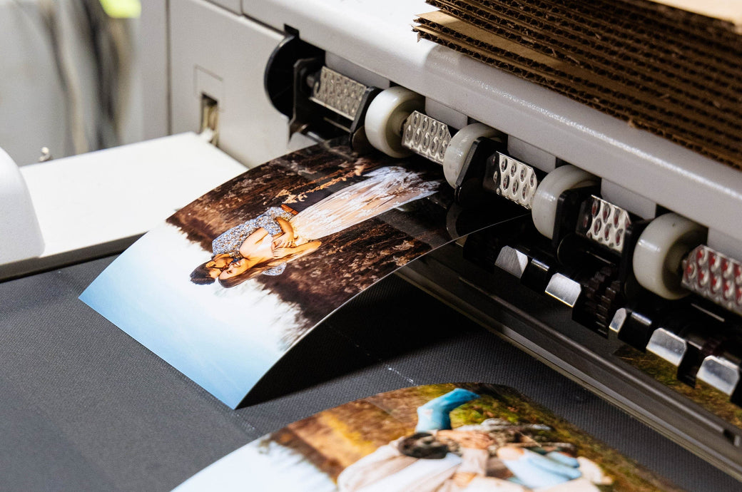
High-quality printing is an essential aspect of producing visually appealing materials, whether for business or personal projects. To achieve exceptional results, consider the importance of paper quality. Choosing the right paper stock can significantly impact the final output, enhancing color vibrancy and sharpness. Additionally, ensure that the printer settings are correctly configured for the desired output. This includes selecting the proper resolution, which typically ranges from 300 to 600 DPI for high-quality prints, and adjusting color settings to match the intended design.
Incorporating the right printing techniques is vital for achieving professional results. Techniques such as offset printing, digital printing, and screen printing each have their unique advantages depending on the project scale and materials. For instance, offset printing is ideal for large volumes due to its cost-effectiveness, while digital printing is preferred for shorter runs and quick turnarounds. Experimenting with different finishes, such as glossy or matte laminations, can also elevate the aesthetic of your printed pieces. Lastly, always conduct a test print before the final run to ensure everything meets your expectations.

Essential Printing Terminology Every Designer Should Know
Understanding essential printing terminology is crucial for designers to communicate effectively with printing professionals and achieve the desired results. Some key terms include CMYK, the color model used in color printing, which stands for Cyan, Magenta, Yellow, and Key (Black). Another important term is dpi (dots per inch), which measures the resolution of printed images; a higher dpi results in better image quality. Additionally, bleed refers to the area outside the final trim size where the ink extends, preventing unwanted white edges on the printed piece. Familiarity with these terms can enhance the design process and ensure that the final product meets quality standards.
Other essential terminology includes vector and raster graphics. Vector graphics are composed of paths defined by mathematical equations, allowing for scalability without loss of quality, while raster graphics are pixel-based and can lose clarity when enlarged. Understanding proofing is also vital; this process involves creating a sample print to evaluate colors and layouts before the final print run. Lastly, knowing about finishing options, such as lamination and die-cutting, can help designers make informed decisions that enhance the aesthetic appeal and functionality of their work. By mastering these terms, designers can streamline the printing process and elevate their design projects.
How to Choose the Right Paper for Your Printing Projects
Choosing the right paper for your printing projects is crucial to achieving the desired outcome. With a variety of paper types available, from glossy to matte finishes, understanding the purpose of your project is the first step. For instance, if you're printing photographs, a high-quality glossy paper can enhance color vibrancy and detail. In contrast, for professional presentations or resumes, a clean and sophisticated matte paper can project a sense of professionalism and clarity. Consider the weight and thickness of the paper as well; heavier papers typically convey durability and quality, making them ideal for important documents.
Next, it's essential to consider the printing method being used. Different printers may require specific types of paper for optimal results. For example, if you're using an inkjet printer, papers designed specifically for inkjet printing often have special coatings that enhance ink absorption and drying times. Additionally, budget constraints can play a role in your decision-making. Always weigh the cost against the final expected quality of your project. By keeping these factors in mind and conducting a little research on paper specifications, you can confidently select the right paper that meets both your aesthetic and practical needs.